Prevail Legal
From trial-and-error to trial-ready tools
Prevail Sessions is a virtual court reporting platform that combines AI transcription and testimony management services. The redesigned experience modernized an outdated, developer-built interface and introduced features that mirrored real-world behaviors. This resulted in a flexible, forward-thinking platform that helps legal professionals work more efficiently in a digital environment.
My role
Customer problem
Business problem
I joined the legal startup in September 2021 as their first and only UX designer at the time. Within five months, I designed and shipped three distinct products, including Prevail Sessions. I quickly became the owner of many hats by helping integrate design into the agile process; shaping the product roadmap; and rallied teams around our short- and long-term vision.
Stenographers, piles of paper and lots of time and money were getting lost in the archaic ways of depositions. Our job was to teach attorneys new digital behaviors in a way that still felt familiar while reducing cost and prevail faster.
Before I joined, the dev team owned the front-end. This resulted in confusing UX, visual inconsistency, and frustrated users. We needed to shift from engineering-first to customer-centric focus. That meant rethinking every part of the platform to bridge tradition and technology.
Discover
Fresh eyes
Starting at Prevail was intimidating to say the least. I had no legal background and little time to get acquainted with the nuances of depositions and other legal proceedings. All I could do was to jump right in, use my novice mind and fresh eyes to find a solution. From what I was starting with, it could only go up from here.
Understanding the pain points
Kickoff with the CTO
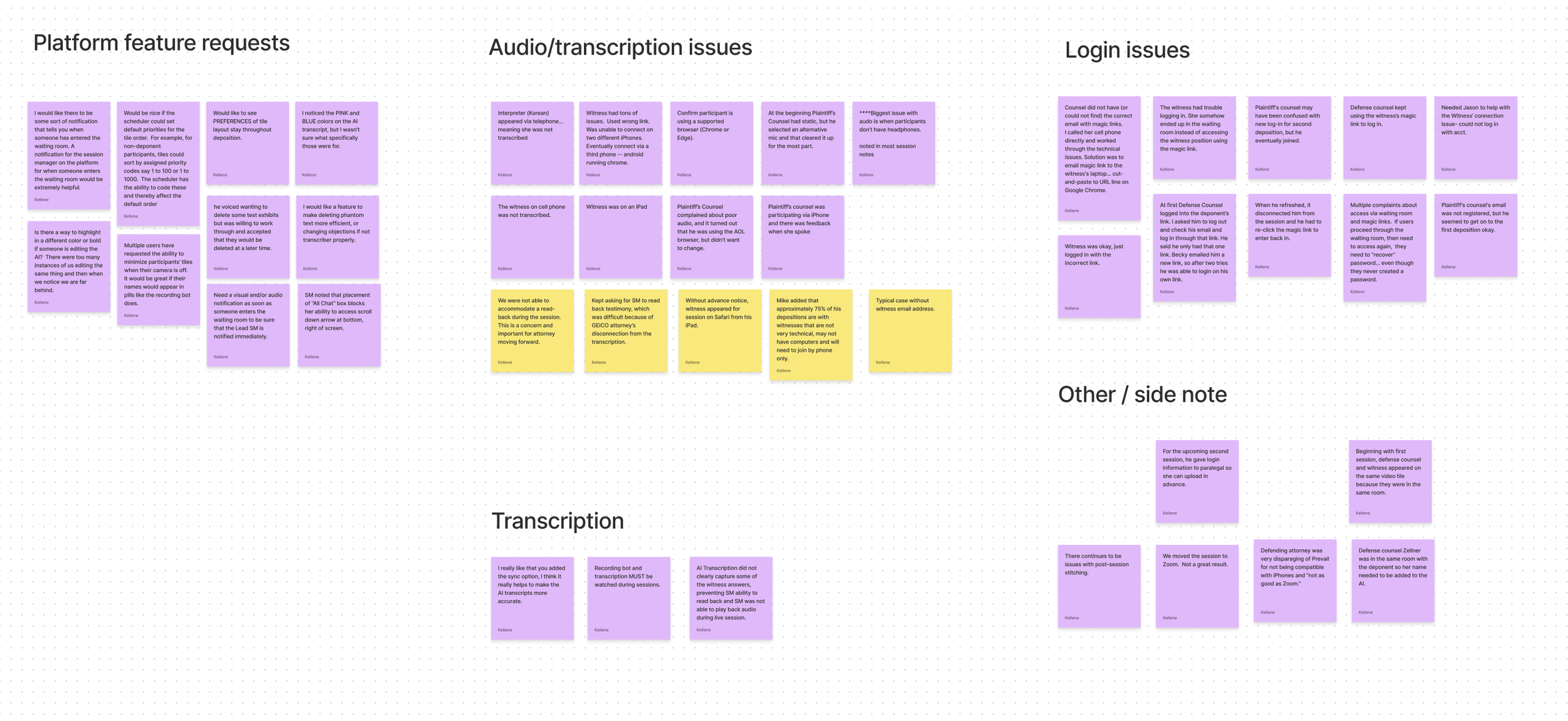
I started off by conducting interviews with our support team to understand the trends and issues leading up to, during and following a deposition. I spent hours reading loads of reports generated after a session that outlined issues attorneys were experiencing on the platform. Then I took to researching both well-known and up-and-coming video conferencing platforms to discover commonalities and best practices to distill into our product. I documented everything on a shared Mural board.
Following an investor meeting, our CTO announced that our top priority was to redesign both the front-end and back-end of Prevail Sessions. The goal was to keep much of the functionality the same, but update the code, UX and UI.
Define
Outline before sketches
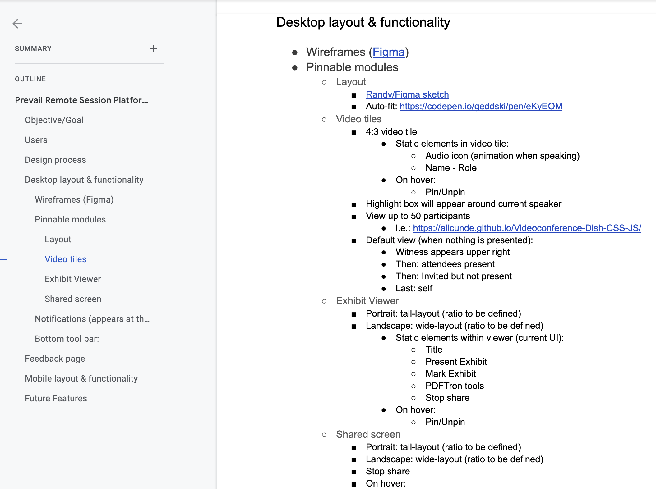
Before diving into wireframes, I created a detailed product outline: project objectives, user access levels, layout zones, and key interactions. It became our source of truth — useful to devs, stakeholders, and for guiding design decisions and what would make into the MVP.
A moving target
While the launch date shifted multiple times, delivering high-fidelity mockups early allowed for deep collaboration with devs. We iterated on feasibility, added features based on ongoing client feedback, and fine-tuned the experience sprint by sprint.
Design
Whiteboards to wireframes
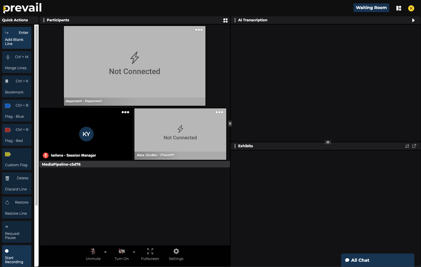
Our CTO wanted to ensure that we had a “pinnable” area and drew out on his whiteboard what he had in mind. From there, I began wireframing placement of video tiles, panels and other features.

Consistency is key
Each developer owned a piece of the platform. To adapt to their needs and ensure cohesion, I created individual annotated frames tied to the original product outline. This helped keep the build aligned, frame by frame.

A new (design) system
There was a lot of inconsistency across the brand from different owners over the years. Creating a design system for the platform and for the branding was a game changer. This not only a big learning experience, but also sped up my own workflow, gave devs reusable components and a common design language.

Refine & deliver
Final result
Here's a video of the product as it was when I left in 2022. It was no easy feat, but it’s rewarding to see every detail and interaction come to life. All in service of a more intuitive, modern, and flexible experience for attorneys.
Outcome
With research and collaboration at the core, I helped create a clean, customizable interface that respected traditional workflows while nudging users into a better digital experience. I was able to push boundaries and deliver a seamless platform ahead of schedule.
Reflection
Working with developers = unlearning “perfect”
In design bootcamp, you tie everything up in a bow and toss it over the dev wall. At Prevail, I learned that bow never really exists. I had to shift from “please do this” to “is this possible?” And more often than not, devs responded with, “we can do that and more!” It was a masterclass in creative compromise and in thinking bigger while staying focused on what really matters right now.