A financial service company*
Applying universal design to a beloved car
On the post login homepage of a financial firm, there are a few things you might expect: dollar amounts, line charts, and other financial figures. But one thing you might not expect is a car. This cute little yellow car was designed about 10 years ago as a fun way to educate visitors about their retirement savings. It also came with a myriad of accessibility and user issues.
*Due to confidentiality, I’m not allowed to name the financial company and have omitted some details and altered some images.
My role
Not another case study
I was the lead Sr. UX Designer on this experience starting in January 2024. I initiated the redesign of the experience and guided the squad through the process to address many accessibility concerns as well as visual updates so that visitors clearly understood the goal of the car.
This isn’t your typical case study. Rather, it’s an adaptation of an internal presentation I gave to 100+ designers and content strategists on Global Accessibility Awareness Day in May 2025. I take you through my process and thinking from the perspective of how I addressed accessibility concerns, applied usability principles and initiated a redesign that nobody wanted at first, but in the end made a lot of people happy.
Okay, so imagine me on stage…
A state of (UX) mind
Throughout my career, these two illustrations have always stuck with me.
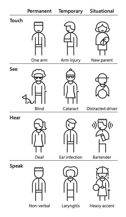
This is from Microsoft's accessibility playbook. This simply puts into context that someone's limitations or abilities isn't always apparent or always permanent. And it changed the way I thought about who I was designing for--it wasn't always someone who needs assistive technology; but someone who might just need extra assistance in general.
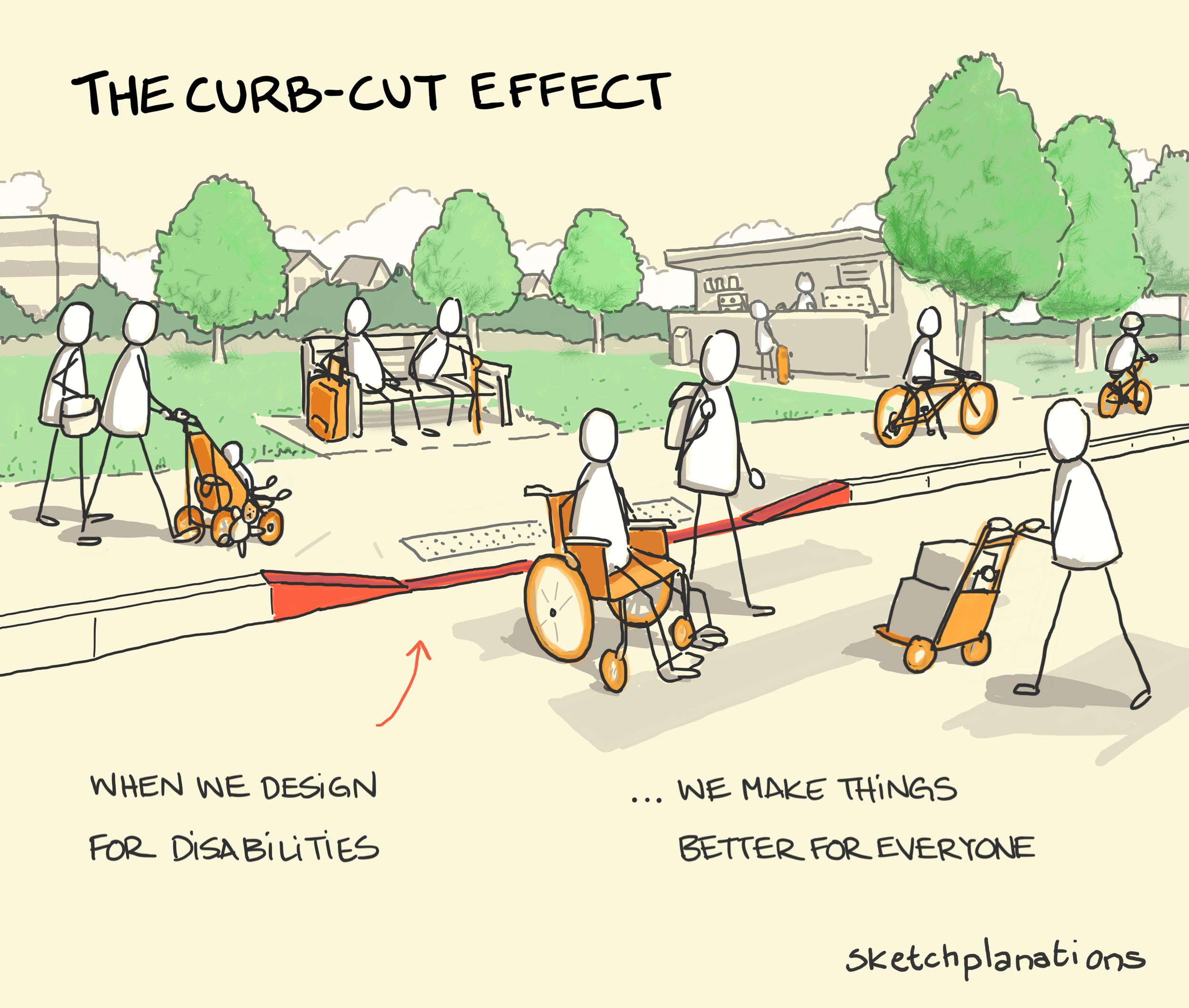
This illustration is from Sketchplanations. A campaign by Berkeley students with disabilities led to adding curb cuts to the sidewalks to make access easier for those in wheelchairs. Turns out, it helped more than just people with wheels.
Having these concepts and ideas floating around in the back of my mind has changed the way I approach my designs.
I obviously want my designs to be seamless and intentional, but also push and change the way "it has always been done" to deliver a design that truly does solve for one and extend to many. And this really came through when I started work on “milestone view.”
What is milestone view?
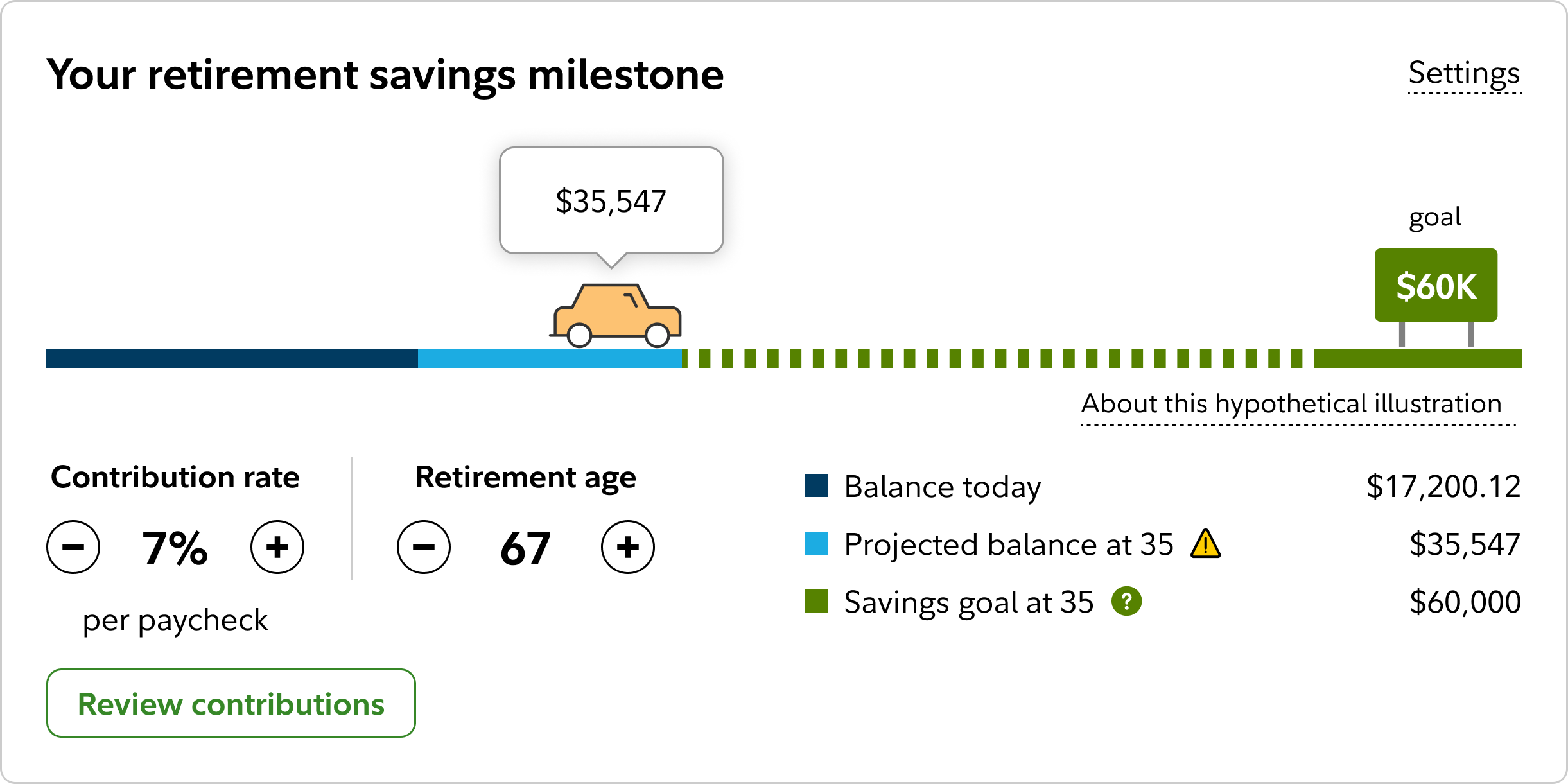
At its core, and how it's mostly known internally is “the car” on the firm’s post login homepage. It’s a retirement modeling tool that educates customers about their savings, estimated future contributions and the effect it has on their retirement income.
From January to May of 2025, this little car has had about 15 million views. It’s kind of a big deal.
Audit of what wasn’t working
An accessibility nightmare
Over the years, there was little questioning on what we are doing and why. It's the old tale of the squad knowing the experience so well that they don't even know it's a problem.
But something didn't sit right with me. Every time I questioned the team, or questioned the logic I was met with a lot of resistance. The more I poked it, the more confused I became in a tangled web of odd-one-off decisions and very tight technical constraints.

I knew the designs were problematic because the devs were coming to me for little design updates to address the pile of backlogged accessibility bug tickets. I brought up the issues at accessibility office hours with possible solutions and was met with an audible sigh. Rightfully so, and I was starting to fear that there was no way out....
Light at the end of the tunnel
In October 2024, we were testing a feature of milestone view and realized that participants were explaining the view incorrectly. To confirm that this might be the case, we tested comprehension by asking questions like “explain this to a friend.”
It turned out people couldn't accurately explain it to a friend. Actually, most users weren't sure what they were looking at.
Finally, validation! The squad came around and agreed to redesign the milestone view. I gathered all my learnings, accessibility bugs, office hour notes and user feedback then headed to my Figma dungeon to see what I could come up with and create the most incredible design to solve for all.
Organize the chaos
No one was in the driver seat or documenting decisions. So I did and created one big Figma of everything anyone might need to know about milestone view. From the methodology to the UXR results to the detailed anatomy of this little 800x400 pixel card. I called out all the accessibility considerations within the design and at every touchpoint, making sure it wasn't an afterthought, rather a baked in.

And it worked! We were out of swirl city and were making decisions, hitting sprint goals and everyone was feeling good about it: the squad, the design gods and accessibility--no more sighs!
Two key pieces of discovery and design helped immensely in conversations. With the accessibility team particularly happy.
First, get the layout right
Second, design in gray scale
I went back to square one and removed any design elements and focus solely on the layout that impacted readout order. While researching possible layouts, I came across the user behavior of feedback loops.
For every action there is a reaction. Based on that reaction, we make a decision.
In our case, the controls were the action a user could take, the reaction was the change in the graph and legend. And the CTA button is the decision.

This seems so obvious yet something many designers skip.
This practice helps empathize with people who experience color blindness, this also helped us empathize with people who might not be financial literate.
Conversations and iterations shifted to: How might we design this for the graph to stand on its own? How might someone look at the graph and understand what we are trying to convey? How might we leverage the legend to tell a story?

This also became very helpful as we started to iterate on the graph. We were tied to a bar graph, but by taking away the limitation of colors and focusing on the story of what the car was trying to show, I was able to design different options and came up with the concept of a map-like journey.
As good as new

What felt like small tweaks under the hood lead to shine new model. Our UXR resulted in increased comprehension and positive feedback.

In the “action section” the controls for contribution rate and retirement age moves the car forward or backwards.
In the “reaction section”, I pulled inspiration from familiar maps to better visualize the journey. Now, we don't rely on color rather iconography.
And finally, the legend tells a story of what they have, where they are going, and how far to go before they reach their target.
End scene
The response from fellow UX designers and content strategists was overwhelmingly positive, reinforcing the value of a user-centered, inclusive approach.
“Thank you for your support of all of the firm’s customers, including those with disabilities. This would not have happened without your courage to take such a well-known and precious experience back to the drawing board, and to question everything (including your own initial work). The results — simplifying, focusing on intent, read order, etc. — will have a huge impact for our users and will empower other designers to do the same. We are grateful for you giving Milestone View some a11y gas in the tank for its eternal journey.”
“I loved your presentation about redoing the car graphic— really brilliant work. I loved the way you approached and reapproached the problem and the way you crafted the solution, the illustrations you used. The way you presented it, a clear story well told of overcoming obstacles and getting teams together — and the deck was really great, and I never say that about anyone’s deck. ”