A financial service company*
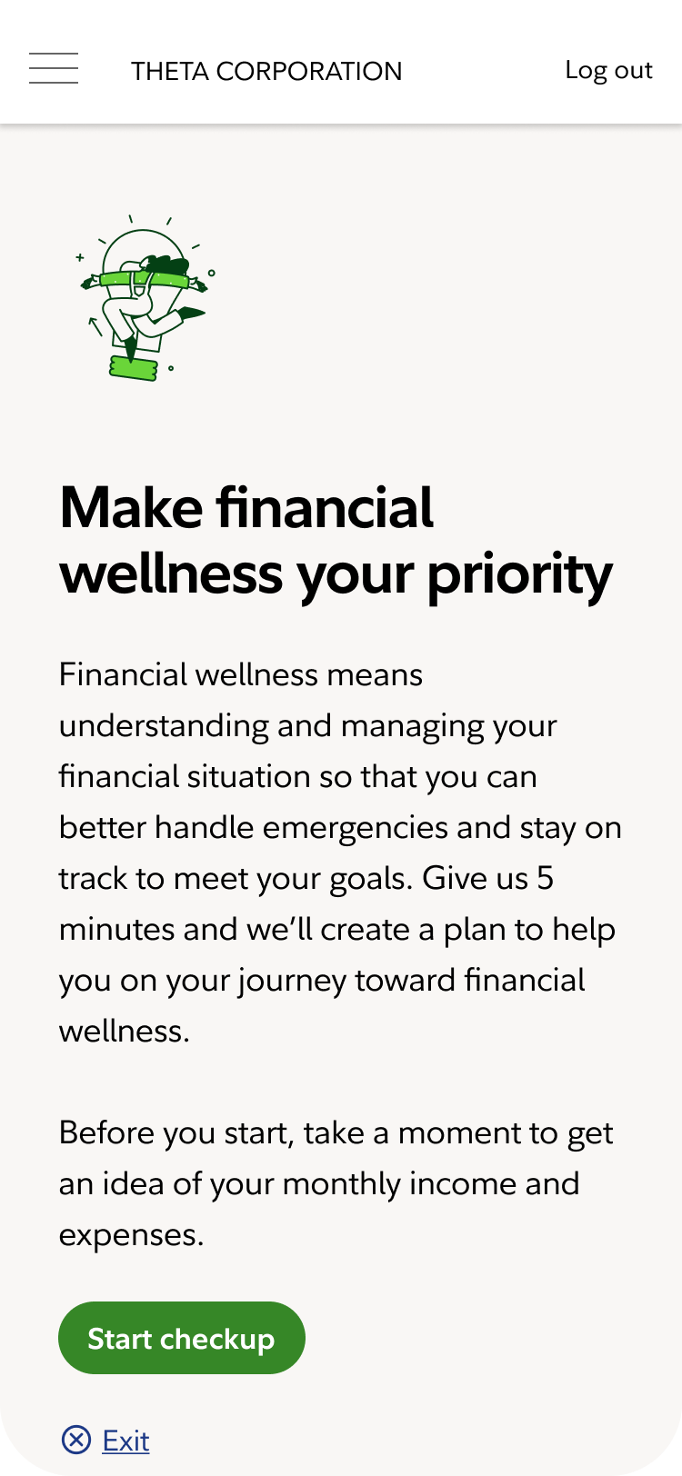
From financial uncertainty to confident first steps
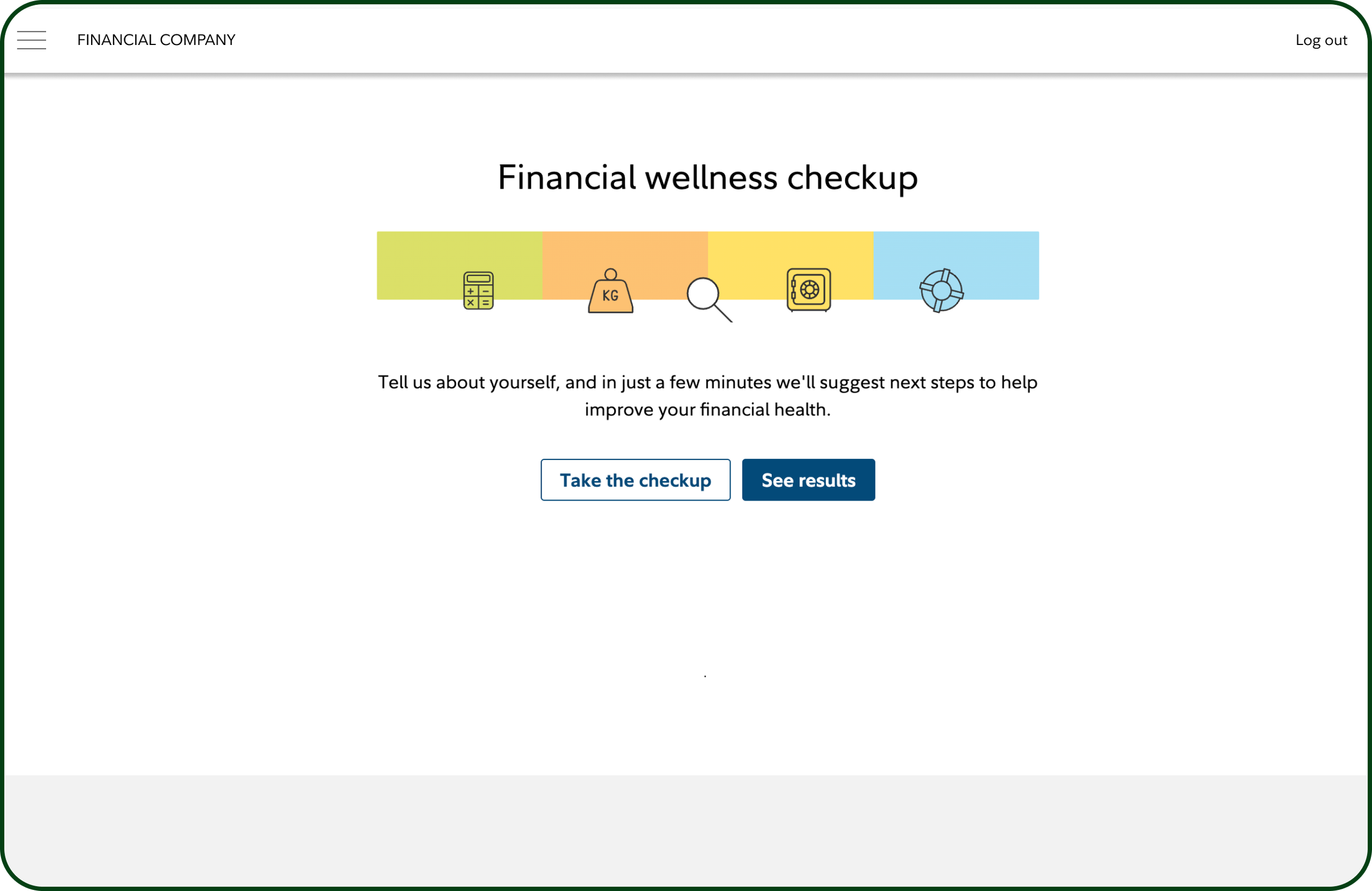
The Financial Wellness Checkup was a clunky, outdated questionnaire that left users overwhelmed and under-informed. Furthermore, it was completely inaccessible to those who use assistive technology or struggle with cognitive load.
*Due to confidentiality, I’m not allowed to name the financial company and have omitted some details and altered some images.
My role
Customer problem
Business problem
I was chosen as lead Sr. UX Designer on this experience starting in January 2024. I led the end-to-end redesign, reframing the experience around a specific customer segment. In partnership with a content strategist and UX researcher, we collaborated with product leaders, developers, accessibility and legal that resulted in higher completion rates and a 40% boost in engagement following the launch.
The original checkup was broad and generic. We refocused it around the “juggler,” a segment of users who struggle to make ends meet; and to guide them toward one clear next step in their financial journey.
This redesign had been shelved and revived multiple times due to shifting priorities. When a big client RFP landed, it became a top priority. The experience was known to have high drop-off and very little return engagement.
Discover
Rallying the troops
To get everyone aligned, I designed and facilitated a two-day Zoom workshop with cross-functional stakeholders. The goal was to agree on MVP, educate teams on our UX process, and build trust. The workshop gave everyone a voice and set a clear path forward.
Understanding the “juggler”
The original version was open to all users, which didn’t make sense to those who were financially sound. We focused the new version on the “juggler,” who makes up 30% of the firm’s customer base. Based on existing research, we knew jugglers:
Are aware of their spending but feel frustrated that they can never seem to catchup
They know the importance of paying down debt but don’t have much of a cushion for necessities
They find financial professionals intimidating, so they turn to their friends and family for help
Define
Set expectations
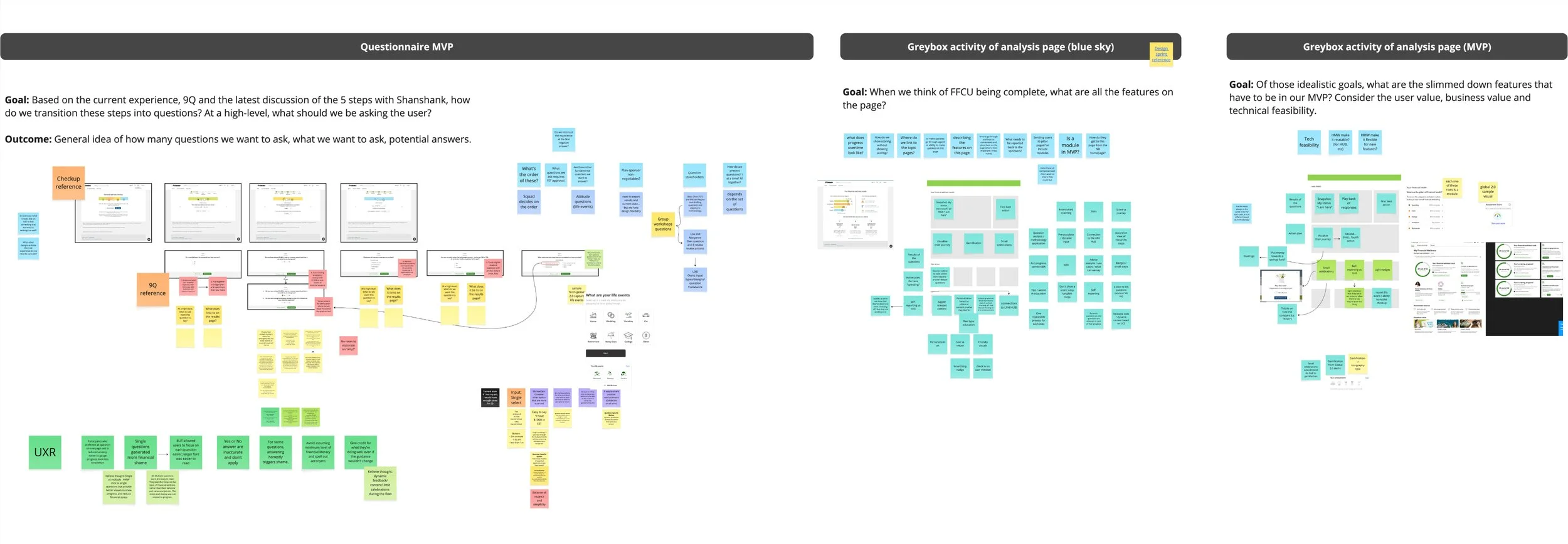
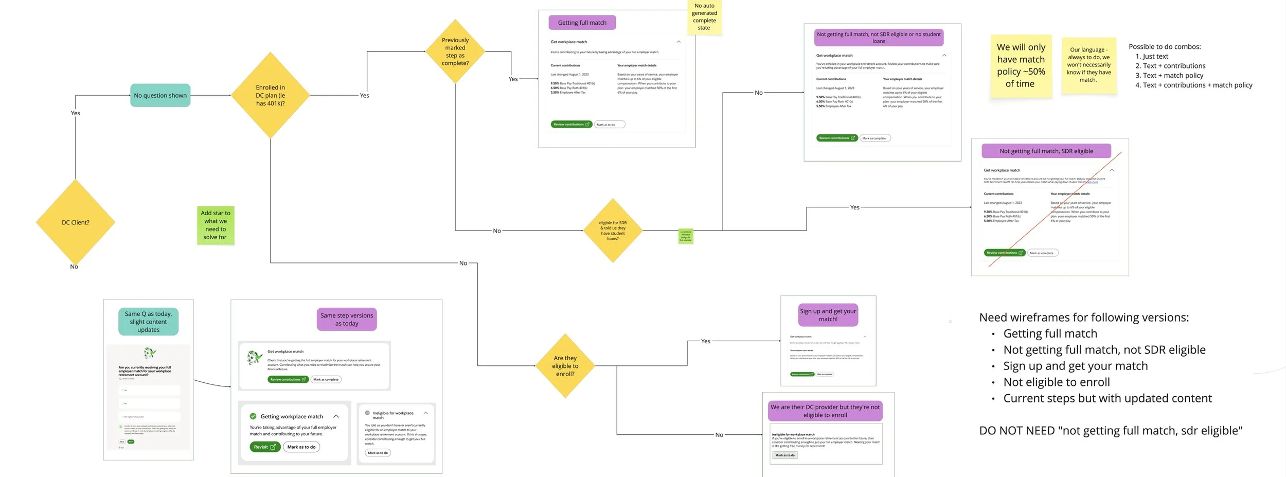
With an RFP deadline looming, we had to move fast. I partnered with my product managers and created a UX planning board to stay transparent with stakeholders and devs, keep initiatives prioritized, and ensure we stayed on track for launch. We used this board weekly to ideate on new topics and align on complex user flows.
Rhyme & reason
Methodology is an important factor across the firm, think of it as the “rhyme and reason” to what we do. We aren’t just saying something because someone said so, but backed by our financial expertise.
For this experience, we worked in a hierarchy model, 8 steps to achieve financial wellness. Each step translated to a question for us to assess how the juggler is doing. Based on their responses, we are able to formulate their unique results on the action plan page.
Design
What it was
Rapid testing
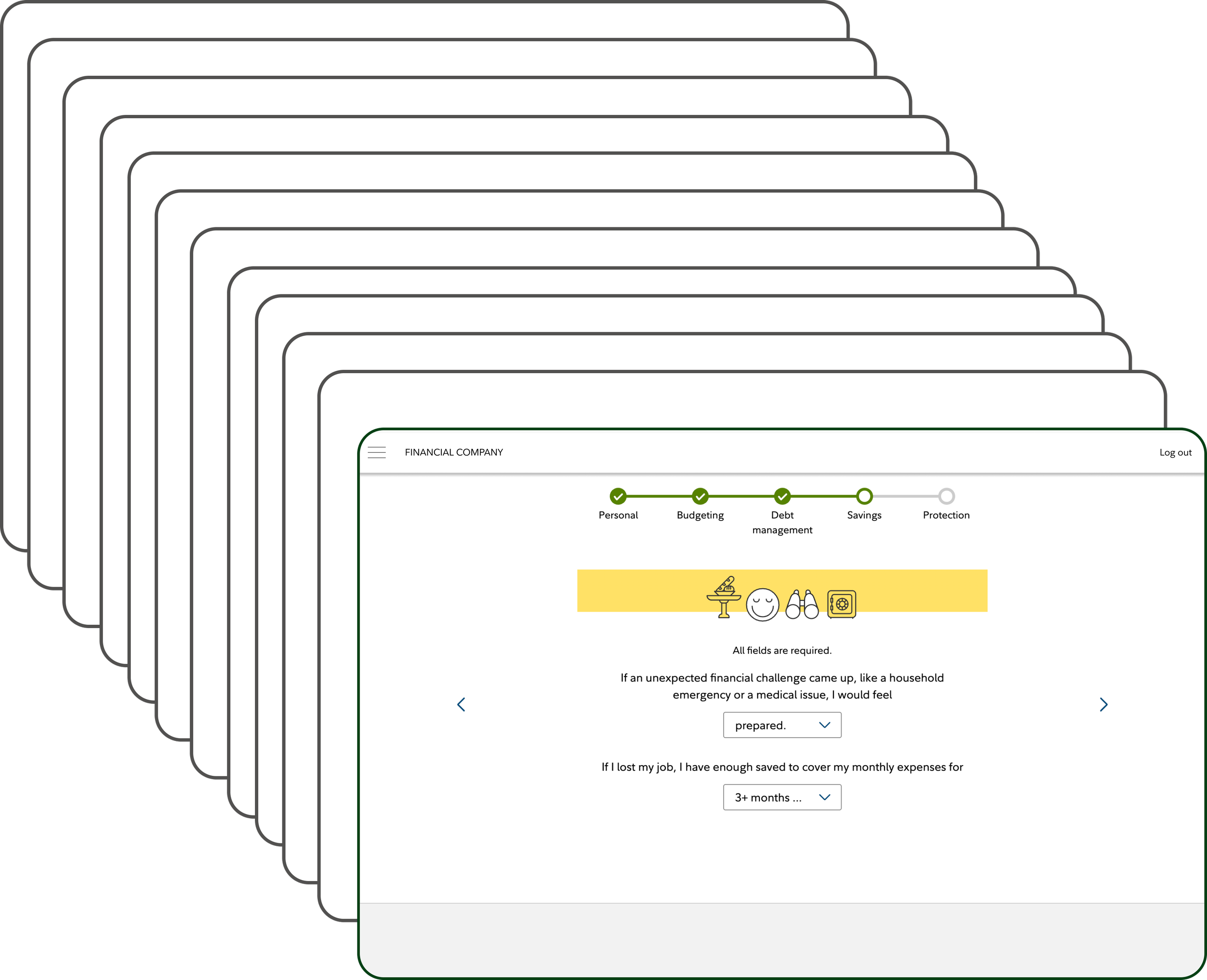
The old experience asked 26 detailed questions. Nearly half of users dropped off by the third page. Those who made it to the action plan often didn’t understand what to do first. Furthermore, the old experience didn't meet accessibility standards.
Mobile first, lo fi

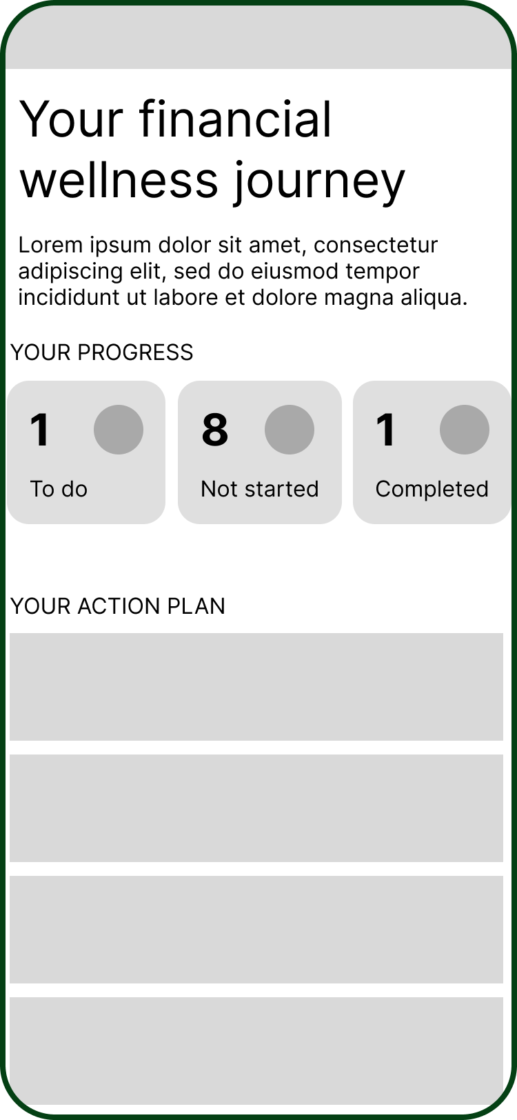
Working within the design system, page templates, and UX patterns, we knew what the questionnaire piece would look like. We focused our creative energy on rethinking the action plan page — making it more clear, more actionable, and more encouraging.

We tested with six users on Usertesting.com to assess if they understood the order of which to complete the steps, if there were any pain points, as well as preference of certain elements.
Insight
Numbering the steps isn’t helpful—users understood that was at the top was the first step to complete

Insight
Seeing all the steps would be overwhelming. They wanted a balance of knowing what is next but not showing everything.
Refine & deliver
Page anatomy
Final product
As we moved into high fidelity, I created a page anatomy diagram aligned with user insights. This is where I started all my conversations, to level set and visualize the why behind these decisions, and that it was designed with intention and backed by user feedback. And that really helped in tough conversations where sometimes, some people just didn’t like it. Or had a difference of opinions.

With the new designs, we get straight to the point asking 9 questions that align to the action plan page so that users then know what to expect.
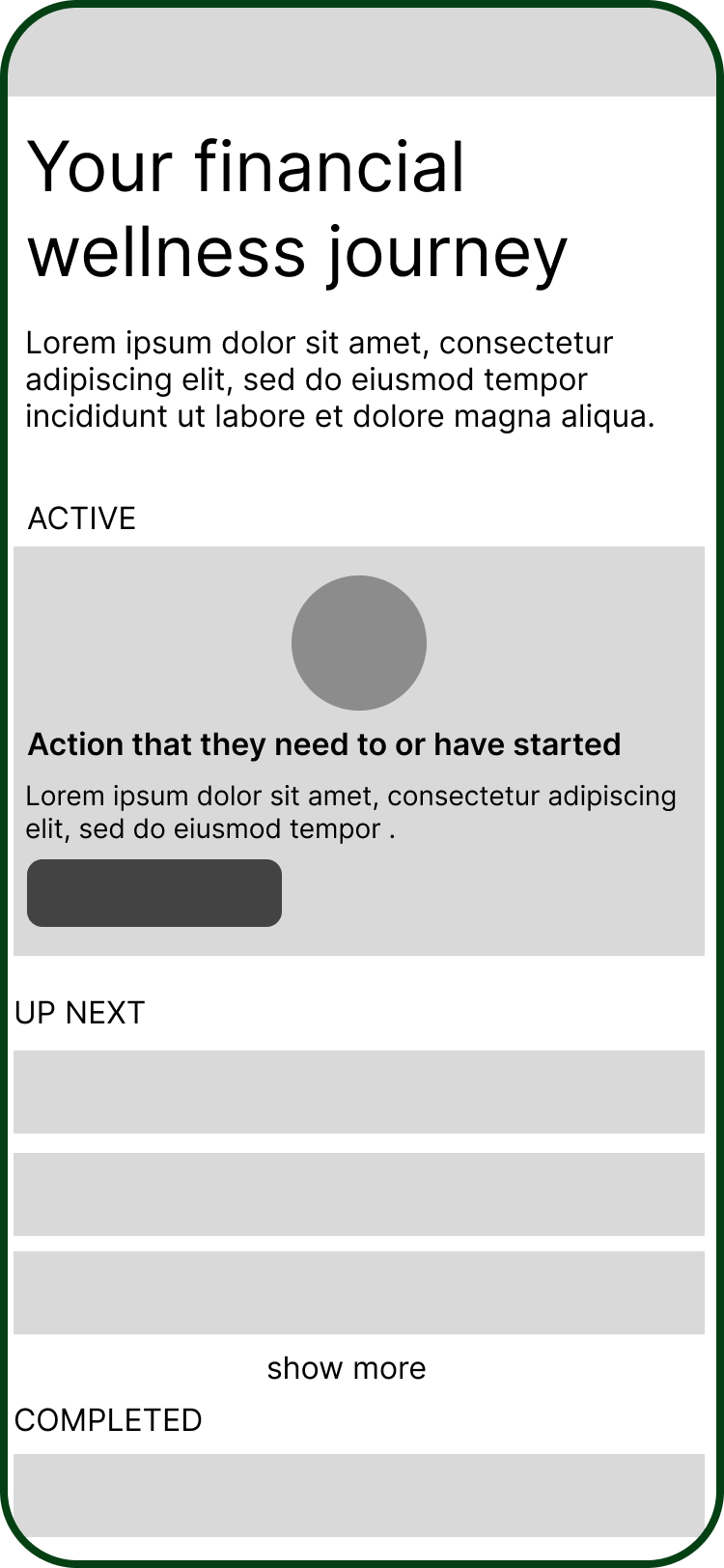
Once they get to the action plan page, at the top they see this first topic they should focus on based on their responses. And give visual importance of what they may have already completed to give them confidence and motivation to keep going.


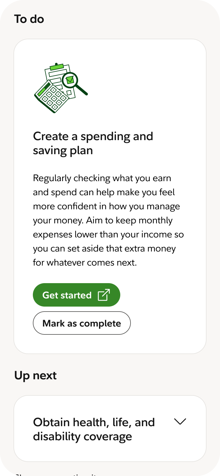


While we encourage them to follow an order, we do not force it. We wanted to give customers the flexibility to explore and mark complete or move it back to “to do” based on their unique circumstance.
They have the ability behind a few clicks to preview all the “up next” steps. They can explore each step by click “get started” and completing the task or learning more about that topic. If they believe it’s complete, they self-report by clicking “mark complete”.
We are handling all prioritization for the user so the “to do” and “up next” steps will always be organized in the order suggested by the hierarchy. Our audience doesn’t have to worry about figuring out which step comes next or keeping track of step numbers, because we are always going to focus their attention on their highest priority not-yet-completed step.
Outcome
After launch, we saw 15% increase in checkup completions and 40% increase in engagement on the action plan page.
This was a direct result of clearer layout, fewer question pages, and a redesigned plan that made it obvious what to do next.
We continue to iterate and adjust designs basked on feedback and analytics. All of this has our product roadmap built out through mid-2026.
Reflection
There wasn’t much around this process that was tidy or clear. Priorities kept shifting, stakeholders had competing expectations, and the UX process was unfamiliar to many on the team. But instead of getting frustrated, I took pause when things got sticky to reframe how I could bring clarity by visualizing decisions, and communicating often. In doing this, it helped sharpen my communication and design skills.